Yasha Petrunin

Design UI challenge that led to a 53% reduction in platform navigation time

Role

Led the sidebar navigation overhaul from initializing UI challenge to the final designs and post analysis.

Team

Noa Karni, Matan Verzov, Adiel Ivantsev, Sapir Levi, Lior Mor Fruehling, Asher Miller, Artem Maksimenko, Shahar Pinchasi, Ariel Kleiman, Yuval, Maayan Helpfelbaum

Year: 2022

Duration: 3 months

Deliverables

Qualitative Research
Quantitative Research
Competitive Analysis
Stakeholder interviews

+ Alignment
Prototypes interviews
Information Architecture
Visual Design
Design System Update
Post Release Analysis

SimilarWeb is a data platform providing analytics on web traffic, SEO, PPC, and marketing, used by leading teams such as Nike, IKEA, and Google.

The redesign of sidebar started with a 1.5-hour playful challenge for the entire design team that I organized with our design director, Noa Karni, focusing on improving the existing navigation UI.

This eye-opening session, followed by in-depth research, revealed deep usability issues that went beyond just aesthetic concerns.

In collaboration with my colleagues, I led the platform sidebar overhaul that significantly cut navigation time and boosted user engagement and discoverability.

Role

Led the sidebar navigation overhaul from initializing UI challenge to the final designs and post analysis.

Team

Noa Karni, Matan Verzov, Adiel Ivantsev, Sapir Levi, Lior Mor Fruehling, Asher Miller, Artem Maksimenko, Shahar Pinchasi, Ariel Kleiman, Yuval, Maayan Helpfelbaum

Year: 2022

Duration: 3 months

Deliverables

Qualitative + Quantitative Research


Stakeholder interviews


Prototypes interviews
Information Architecture


Visual Design
Design System Update
Post analysis

SimilarWeb is a data platform providing analytics on web traffic, SEO, PPC, and marketing, used by leading teams such as Nike, IKEA, and Google.

The redesign of sidebar started with a 1.5-hour playful challenge for the entire design team that I organized with our design director, Noa Karni, focusing on improving the existing navigation UI.

This eye-opening session, followed by in-depth research, revealed deep usability issues that went beyond just aesthetic concerns.

In collaboration with my colleagues, I led the platform sidebar overhaul that significantly cut navigation time and boosted user engagement and discoverability.

After

Before

Revamped Sidebar Animations

Project Highlights

Challenge

Core platform users struggled to find what they needed, while many product features faced discoverability issues

Solution

We simplified navigation structure by one level and ensuring sidebar UX patterns consistency across the platform.

Results

The sidebar overhaul resulted in:

  • significant cut of avg. navigation time

  • increase in median page views per user

  • boost of engagement and discoverability

Expectedly

Research showed:
Outdated sidebar increases navigation time and packed with usability issues

Working closely with Design director Noa Karni, we developed a strategy to tackle the sidebar problem.
First step: Conduct thorough research to uncover the full scope of issues and convince stakeholders of the necessity for improved navigation.
We formed a 'task force' of designers, ready to address this challenge while managing their existing projects.

By dividing research tasks, we quickly collected critical feedback.
It was clear: The sidebar was a major pain point for users, colleagues, and stakeholders.

This groundwork crucially helped us advocating for a comprehensive sidebar redesign.

After collecting,
we grouped all
the feedback into
specific buckets

After collecting,
we grouped all
the feedback into
specific buckets

After collecting,
we grouped all
the feedback into
specific buckets

Activities & Outputs

Qualitative research

Users, Stakeholders and colleagues, Gong calls analysis

Qualitative research

Users, Stakeholders and colleagues, Gong calls analysis

Qualitative research

Users, Stakeholders and colleagues, Gong calls analysis

Quantitative research

Mixpanel, Fullstory, WeBi

Quantitative research

Mixpanel, Fullstory, WeBi

Quantitative research

Mixpanel, Fullstory, WeBi

Data collection from other channels

Product board, Support tickets, G2 comments

Data collection from other channels

Product board, Support tickets, G2 comments

Data collection from other channels

Product board, Support tickets, G2 comments

Notion database

With structured data and feedback

Notion database

With structured data and feedback

Notion database

With structured data and feedback

Competitive analysis

Including best practices and direct market rivals such as Semrush

Competitive analysis

Including best practices and direct market rivals such as Semrush

Competitive analysis

Including best practices and direct market rivals such as Semrush

Exploring Solutions

Time & tech constraints: we strategically decided to refine, not redefine our platform navigation

Using research, we set clear goals along with measurable KPIs to precisely target improvements.


In a number of brainstorming sessions, our dedicated team identified 12 essential tasks to address navigation issues. Prioritizing tasks for potential impact, I led the charge on critical updates, refining platform hierarchies, refreshing the UI and saving user preferences.


After we distilled our insights and design concepts into a sharp deck, setting the stage for stakeholders buy-in.

  • Concept 1.2

    Website Analysis Subsection

  • Concept 2.0

    Website Analysis Subsection

    SEO Subsection

  • Concept 3.0 • Dark

    Website Analysis Subsection

    SEO Subsection

    Scroll

    Dashboards

    Sidebar Promo

    Account Page

  • Pinned Reports

    Sticky Pinned Reports

    Unpinning Report

  • Concept 3.0 • White

  • Concept 1.2

    Website Analysis Subsection

  • Concept 2.0

    Website Analysis Subsection

    SEO Subsection

  • Pinned Reports

    Sticky Pinned Reports

    Unpinning Report

  • Concept 3.0 • Dark

    Website Analysis Subsection

    SEO Subsection

    Scroll

    Dashboards

    Sidebar Promo

    Account Page

  • Concept 3.0 • White

Activities & Outputs

3 brainstorming sessions + a variety of conceptual solutions for each of the priority tasks


3 brainstorming sessions + a variety of conceptual solutions for each of the priority tasks


3 brainstorming sessions + a variety of conceptual solutions for each of the priority tasks


Deck for stakeholders

Where we distilled insights, concepts and initial roadmap

Deck for stakeholders

Where we distilled insights, concepts and initial roadmap

Deck for stakeholders

Where we distilled insights, concepts and initial roadmap

Initial PRD with Goals & KPIs

We focused on UI refresh, UX consistency, reducing navigation time and improving discoverability

Initial PRD with Goals & KPIs

We focused on UI refresh, UX consistency, reducing navigation time and improving discoverability

Initial PRD with Goals & KPIs

We focused on UI refresh, UX consistency, reducing navigation time and improving discoverability

Post-approval discovery

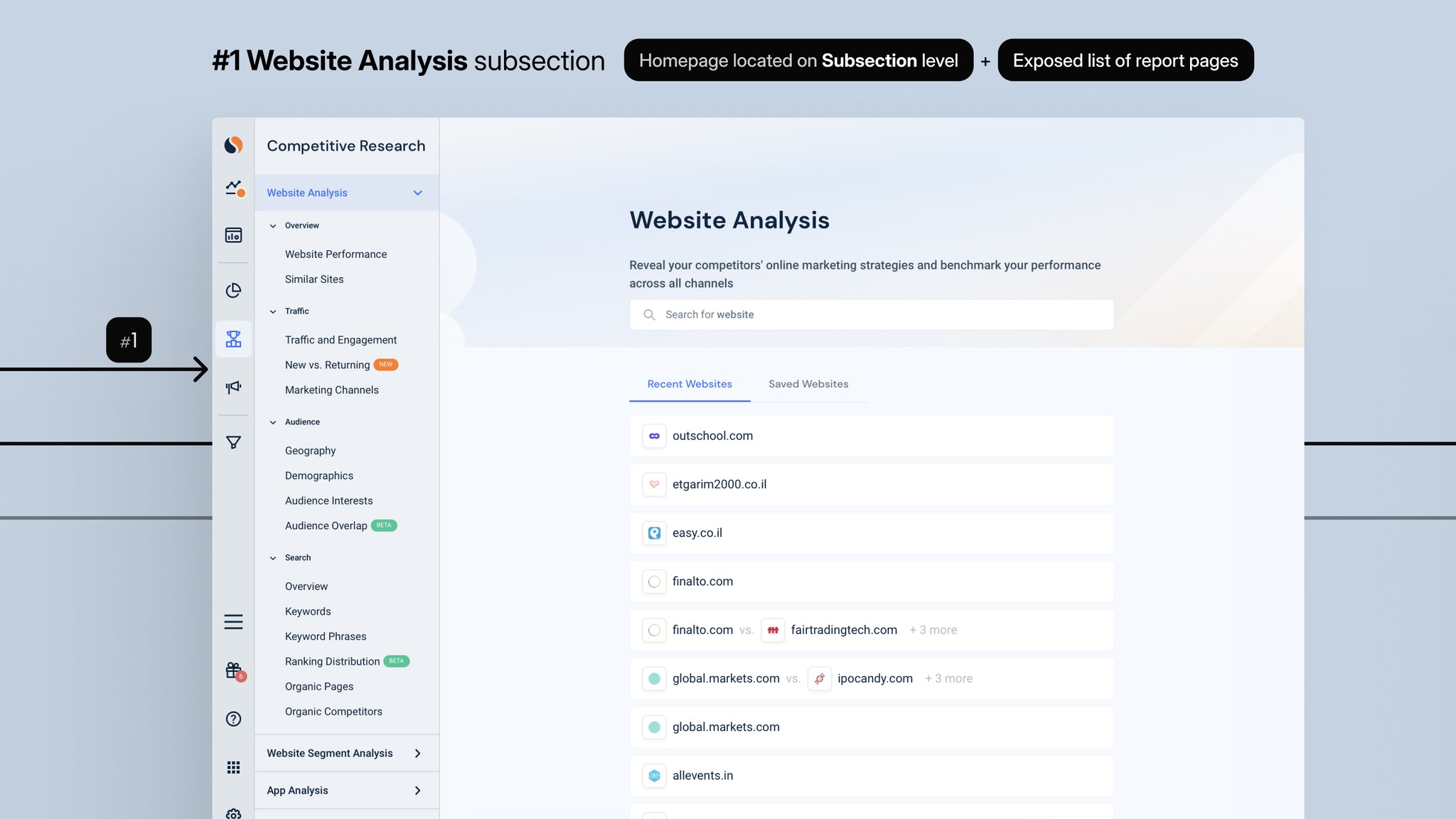
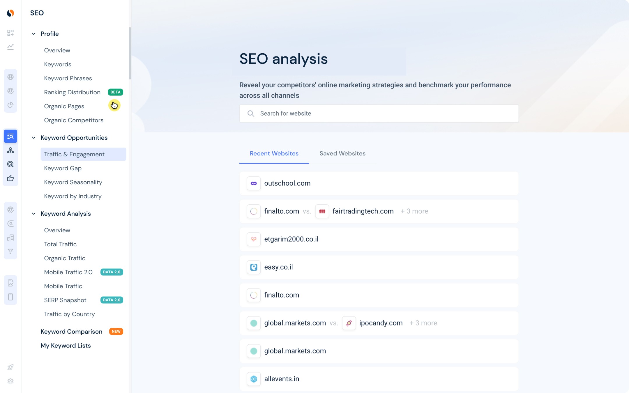
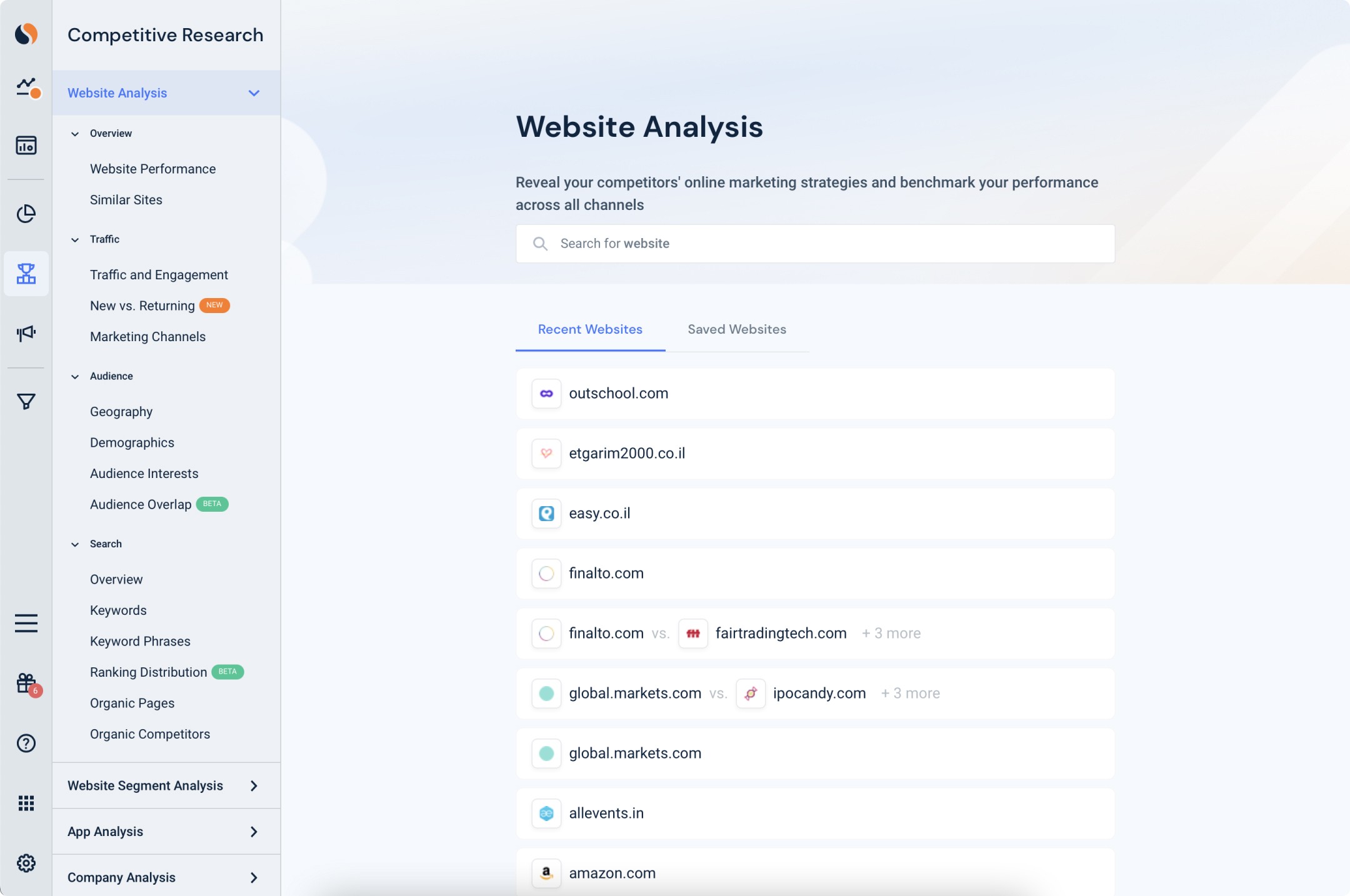
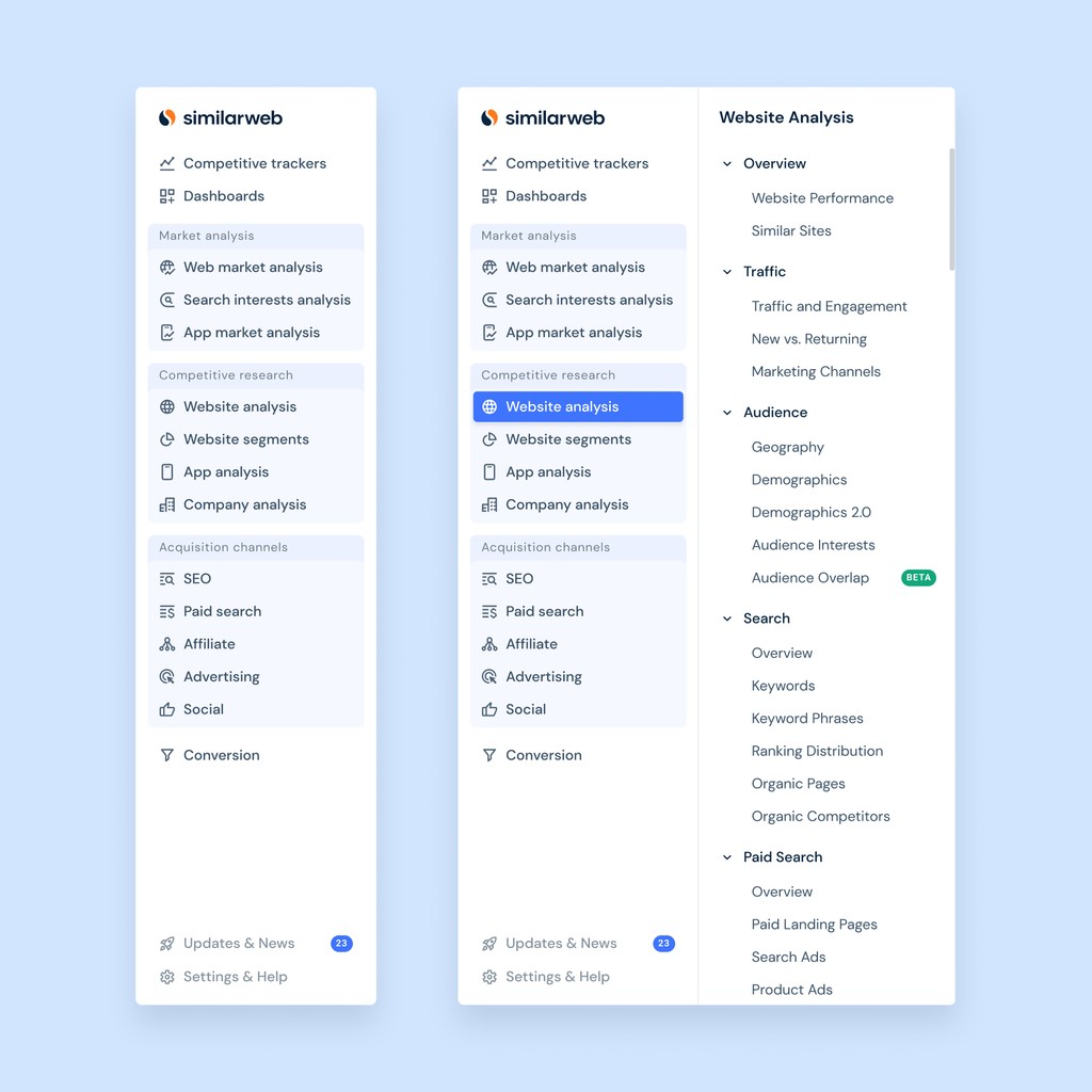
With stakeholders nod: 3 types of sidebar’s Information Architecture unveiled

Initially focusing on thoroughly mapping out all sidebar user flows, I quickly uncovered major discrepancies in the Homepage structures and secondary sidebar levels across various sections.


This insight drove me to formulate a comprehensive proposal for aligning our informational architecture, complemented by alternative option, so that our teams and stakeholders can evaluate different solutions.

Data-driven commitment

Turning 0.6% Engagement rate into convincing argument to remove the Acquisition Homepage and align IA

Discovering that only a small number of users interacted with the Acquisition Homepage was pivotal in convincing skeptical stakeholders and got a practical commitment to a cross-platform consistency.

In collaboration with our Dev and Product leaders, we refined our platform's Informational Architecture:

  • Removing the Acquisition homepage to streamline user experience

  • Reusing existing pages as new homepages for subsections, avoiding the need for additional development

  • Preserving report pages in the secondary sidebar to keep valuable structures intact

  • Limiting sections without exposed report pages to the primary sidebar, addressing technical constraints

#3 Acquisition channels subsection

#3 Acquisition channels subsection

#2 Company Analysis subsection

#2 Company Analysis subsection

#1 Website Analysis subsection

#1 Website Analysis subsection

#1 Website Analysis subsection

#2 Company Analysis subsection

#3 Acquisition channels subsection

Activities & Outputs

User flows mapping &
Technical constrains

analysis docs

Strategic Concept of new Informational Architecture

Major Commitment with

Product Directors


Concept Evaluation

11 prototype interviews revealed only minor issues, confirming concept's strength

After aligning on the overall concept, considering all constraints, I crafted a prototype that closely resembled the interface we aimed to develop. 

For the following interviews, I prepared:
Prototype covering all major user flows across sections, addressing the previously diverse Informational Architectures
Comprehensive list of tasks and questions to guide the participants

We conducted 5 interviews with a varied group of actual platform users and 6 sessions with our Go-To-Market (GTM) and Customer Success (CSA) managers. 

These meetings aimed to collect qualitative feedback, revealing only minor issues and affirming the concept’s viability.

"

This is a lot cleaner than what you guys are running with today.
I think with some modifications it could be even cleaner but I really like what you've done with the grouping on the left-hand side across sections.

Kelly, one of our respondents

Tested Prototype

Tested Prototype

Following user feedback, we adjusted the primary level collapse animation to keep the section icons steady

Following user feedback, we adjusted the primary level collapse animation to keep the section icons steady

Tested Prototype

Following user feedback, we adjusted the primary level collapse animation to keep the section icons steady

Unstoppable sidebaring

Filling the PM void: overcoming team shifts without losing a step

After a series of interviews, we refined our sidebar concept and wrote our Product Requirements Document (PRD), which now includes detailed terminology, edge cases, event tracking requirements, release stages, and updated development roadmap.


The development process presented unique challenges:

  • During significant team changes, I stepped in to guide our team during a period without a Project Manager

  • I led the design of new components, interaction solutions, and a custom icon set specifically for the sidebar project, expanding our design system

  • Coordinating with multiple teams, I ensured the new sidebar's seamless cross-platform integration

Despite the challenges of team dynamics and technical hurdles, our commitment to developing the new sidebar navigation kept the project on track, helping us move forward.

Sidebar final Designs + Various states

New Icons Set

Design System Components Structure

Activities & Outputs

Detailed PRD

+ event tracking requirements
+ release stages & updated roadmap

Final design solutions

Interaction design, updated UX and UI solutions

Custom Icon Set

Specifically for the New Sidebar

Design System Update

Including over 100 components and various states

Unstoppable sidebaring

Unexpected rollout becomes silent success: new navigation was effortlessly adopted

Friday evening, our design director Noa informed me the new sidebar had been accidentally released two weeks prior. 


Initially shocked, we quickly regrouped to plan our next steps. Checking Fullstory sessions and other feedback sources, we realized that we hadn’t received any complaints, support tickets, or even critical feedback—only a few dispersed positive comments from CSMs surprised by the change. 


Alongside key stakeholders, we decided not to roll back the sidebar despite the need to overhaul our entire release plan, including marketing activities and materials.

In response to this unexpected launch, we collaborated with UX researchers to conduct post-release interviews, seeking to understand how users were adapting to the new navigation. Our analysis revealed an improved user flow, with essentially fewer clicks required to access major features.


The lack of direct responses to our questions about the sidebar quickly revealed a telling sign: the absence of interest or issues indicated users found the navigation intuitive and trouble-free, reflecting the idea of effective navigation—unobtrusive and easily understood.

What customers said

it's just the simplicity – the fact that you've got everything on the side, how easy it is, where everything kind of pops out so that everyone knows exactly where to go if they need the relevant information. I think it's a really positive change and we're absolutely loving it so far!

Ben, Media Analyst at Anything is Possible Media Limited

"

Is this just a way to clean up what’s going on with navigation and make it less cluttered on the left-hand side?

Ben, Cofounder at narrative.ai

"

Is this just a way to clean up what’s going on with navigation and make it less cluttered on the left-hand side?

Ben, Cofounder at narrative.ai

"

Is this just a way to clean up what’s going on with navigation and make it less cluttered on the left-hand side?

Ben, Cofounder at narrative.ai

"

I already prefer the sidebar on the left because you can see everything within it...
I'm quite good at softwares but I always get Market Analysis and Competitive Research the wrong way around. The sidebar's layout, which clearly separates all sub-categories, is incredibly helpful when I'm searching for something specific.

Sammie, Analysts & Strategy Market Research at Mail Metro Media

"

Final results

Few month later, together with the Product Manager and Analyst, we found that updating the sidebar was a big win. We made navigation intuitive and consistent, easier for users to get around the platform and find things faster.
Our focused analysis on previously low-engagement pages showed significant improvement in key areas, doubling or even tripling in MAU figures, marking that important features have become more discoverable for users.

Avg. time to navigate

from homepage to the desired page within one hour

Reduced by

↓ 53%

from 1.3 min to 42 sec.

Avg. time to navigate

from homepage to the desired page within one hour

Reduced by

↓ 53%

from 1.3 min to 42 sec.

Avg. time to navigate

from homepage to the desired page within one hour

Reduced by

↓ 53%

from 1.3 min to 42 sec.

MAU Growth

Jan - Feb 2023 vs. April - May 2023

Increased in lower area pages by

↑ x2 - x3

times

MAU Growth

Jan - Feb 2023 vs. April - May 2023

Increased in lower area pages by

↑ x2 - x3

times

MAU Growth

Jan - Feb 2023 vs. April - May 2023

Increased in lower area pages by

↑ x2 - x3

times

Median number of pageviews per user

within 1 session

Increased by

↑ 10%

from 4.5 to 5

Median number of pageviews per user

within 1 session

Increased by

↑ 10%

from 4.5 to 5

Median number of pageviews per user

within 1 session

Increased by

↑ 10%

from 4.5 to 5

Sections Return Rate*

within 10 min • First time users — *Factually it is Engagement

Acquisition Channels Section

Increased by

↑ x2.5

from 20% to 70%

Acquisition Channels Section

Increased by

↑ x2.5

from 20% to 70%

Acquisition Channels Section

Increased by

↑ x2.5

from 20% to 70%

Market Analysis

Increased by

↑ x1.4

from 20% to 48%

Market Analysis

Increased by

↑ x1.4

from 20% to 48%

Market Analysis

Increased by

↑ x1.4

from 20% to 48%

Competitive Research

Increased by

↑ 40%

from 44% to 62%

Competitive Research

Increased by

↑ 40%

from 44% to 62%

Competitive Research

Increased by

↑ 40%

from 44% to 62%

Learnings & Conclusion

Better Pre-Launch Coordination

The early rollout highlighted the need to streamline our communication channels for transparent collaboration across teams.
We're working on better release steps so everyone, from the product packaging teams to the PMs, will know that everything's ready and everyone's on the same page for next time.

Feature Integration Strategy

The project's success showed the need for strategic guidelines on feature integration to prevent over-saturation and maintain a seamless user experience.
This will help to keep working more consciously, especially in a long-term, especially applicable for a cross-platform solutions.

This project was a challenging journey over a quarter, but working shoulder to shoulder with so many talented people, gaining invaluable experience in leadership and managing cross-platform projects was truly rewarding.

Always open to interesting challenges ✴︎
Feel free to drop me a line

Always open to interesting challenges ✴︎
Feel free to drop me a line

Always open to interesting challenges ✴︎
Feel free to drop me a line

Copy email

Copy email

Copy email